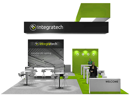
Augmented reality, virtual reality, beacons, and touch screen technology are leading the charge. More and more exhibitors are incorporating these technologies in their exhibition stand designs. Since these technologies excel at creating immersive experiences for visitors. They will only get more prevalent as they get cheaper and more accessible.
Technology makes everything better. It is an exhibitor’s panacea. It seems like everything can be improved by integrating technology. Technology is here to stay. However, the visual elements that make an exhibition stand design remain accessible to every exhibitor. Here are those elements:
- Lighting
- Layout and Space
- Texture
These elements can be enhanced with the use of the latest tech, but they require a savvy mind to combine them creatively.
The appropriate use of these elements is what will make your exhibition stand construction into a creative design. After all, the theme of your stand design will depend on how you present these visual elements. They are simple elements that you have undoubtedly heard off. They are quite common, easy to understand, but difficult to master.
So in this post, we share our perspective on these visual elements to help you look at these visual elements in a new way
Lighting
Your exhibition stand design is like a podium for your brand. What makes podiums impressive is the lighting. Likewise, lighting helps your exhibition stand in so many ways. From setting the ambient mood of your exhibition stand to highlighting products and calling attention to the most exciting parts of your exhibition stand. Here are some common types of lighting you can use:
- Spotlights –Compact and subtle, these lights are meant to make your product stand out. You can also use it to illuminate your banner.
- Floodlights –Ideal for larger exhibition stands, these types of lights are useful to light up a larger area.
- Backlights –Used for creating depth and adding a warm glow to your banners. These also improve the visibility of your booth.
- Rope lighting –Quite underused, but it deserves special mention. Offers a lot of design flexibility when setting up since it comes in various length and colours. It also doubles as an excellent backdrop for your exhibition stand construction.

Layout and Space
Exhibitors make interestingly creative uses of their exhibition space. The box-shaped or rectangular-shaped exhibition isn’t the only layout available to you. Exhibitors can easily manipulate their space to create a diverse experience for visitors. Exhibition stand designs often use layout to guide visitors in a particular way. Waterpick for its stand design created a theatre room and had their exit hallway lined up with product demos. Some more layout designs that are quite likely possible include:
- An upside down room is quite possible; some brands often use it to display their quirky side.
- Some brands turn their exhibition stand designs into storefronts, cafes, even libraries.
- Building meeting rooms to have discussions with clients.
Texture
Going for the ‘modern’ look won’t always help your brand. Unless it is properly thought out, your exhibition stand will end up blending in a sea of similar exhibition stand designs. A lot of exhibitors think about texture. So what do we mean by texture? We mean material, the surface that covers your exhibition stand construction. The texture you choose should be an extension of your stand theme. Going for a homely look? Use wooden panels, choose fabric graphics instead of vinyl ones. Changes like these will instantly make your exhibition stand design look more appealing to an audience. Here are two areas where your choice of texture matters:
- Walls –Walls add depth and texture. They also convey the theme of your brand. Panels, graphics, or LED lights, and touch screen walls often come in several variations. So you can customise them as per your theme.
- Floors –Often the last thing people remember, but it is the first thing they will notice if you get it wrong. So make sure that the colour you choose compliments your walls. Otherwise, visitors will feel noticed.
To Summarise
As you can see, there are more avenues to be creative when planning your exhibition stand construction. Technology is not the only way to stand out. An original design that communicates your authentic brand values through its look will get you further.
About Expo Display Service:-
Expo Display Service has over 3 decades of experience in exhibition stand designing and construction, making it your most reliable exhibition partner in Europe. Started in 1979, we have crafted well over 1000+ stand designs for both our European and international clients.
We have the largest online catalog on exhibition stand designs! With just 3 clicks on our Expo Stand Configurator get your perfect match!


